Ember
Tri-fold brochure design
Visual Designer

Ember needed a trifold brochure to showcase their products, emphasizing the comparison between cast iron stoves and their masonry stove. The goal was to highlight the warmth and eco-friendliness of their stoves while maintaining a strong brand identity, blending modern aesthetics with the company’s values, appealing to customers who seek both style and sustainability.

Research is a key part of my creative process. Everything starts with an interview with someone who truly knows the product—ideally, the CEO. Here, I highlight key insights from my conversation with Ember’s CEO, Daniël Groothuis.
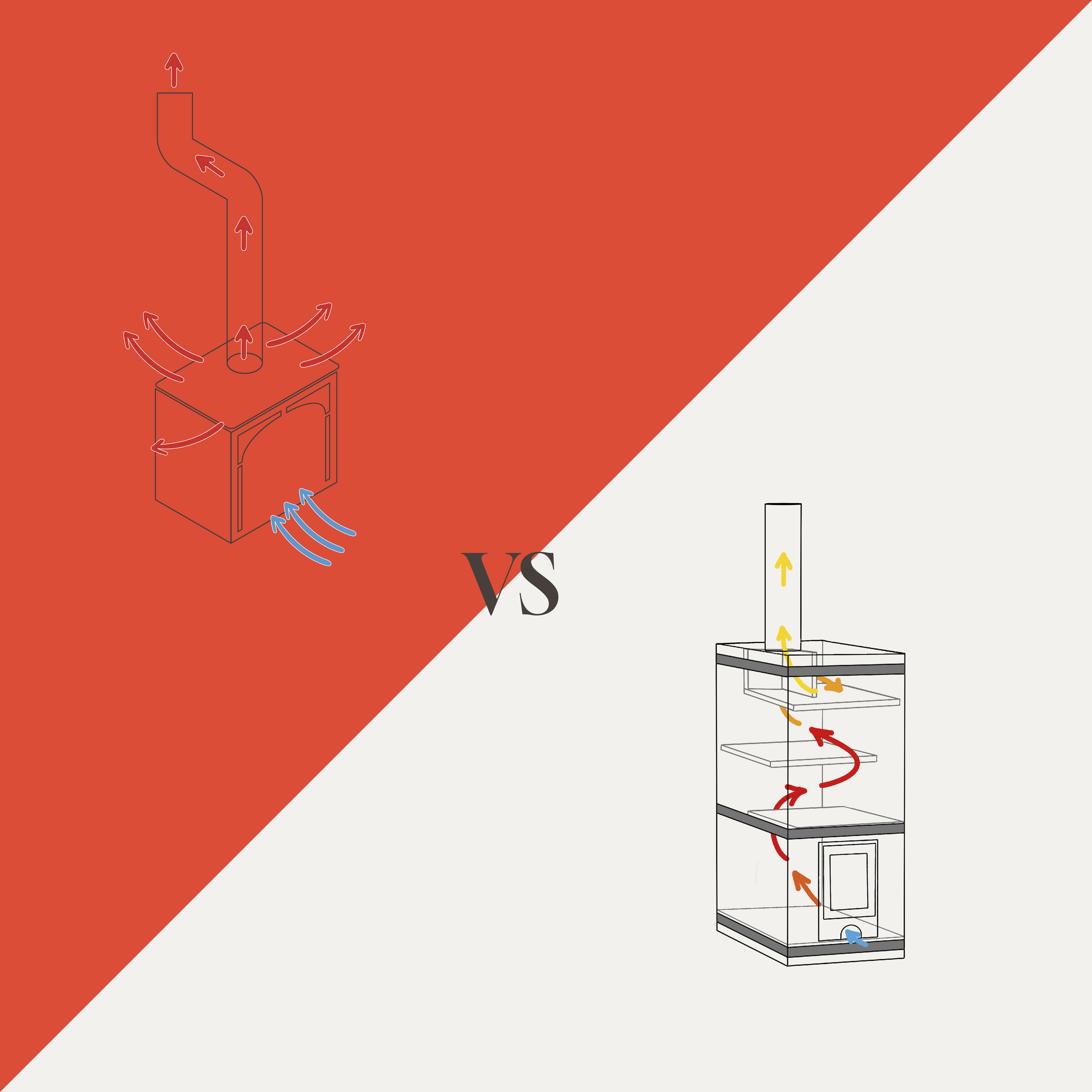
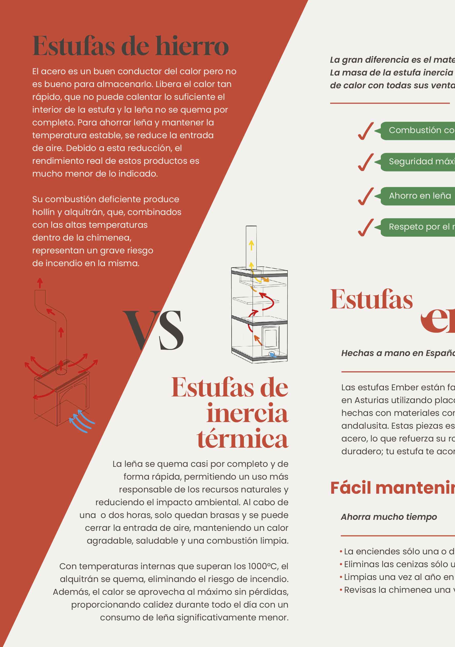
Understanding the main differences between cast iron stoves and thermal inertia stoves, along with their advantages and disadvantages, was a key part of the research process.
The cover of the brochure was designed to immediately capture attention, highlighting the five key features of Ember stoves that set them apart from the competition: eco-friendly, cost-effective, customizable, easy to install, and user-friendly. These features were selected after thorough research on market needs and the advantages of thermal inertia stoves over other models.
We decided to focus the interior of the brochure on comparing iron stoves with masonry stoves, as it was the best way to highlight long-term savings and their lower environmental impact. Beyond explaining the advantages of thermal mass stoves, I centered the content on Ember, emphasizing its handcrafted production in Spain using high-quality materials. I also highlighted its key attributes: customization, easy installation, and low maintenance, positioning it as a superior, efficient, and sustainable choice.


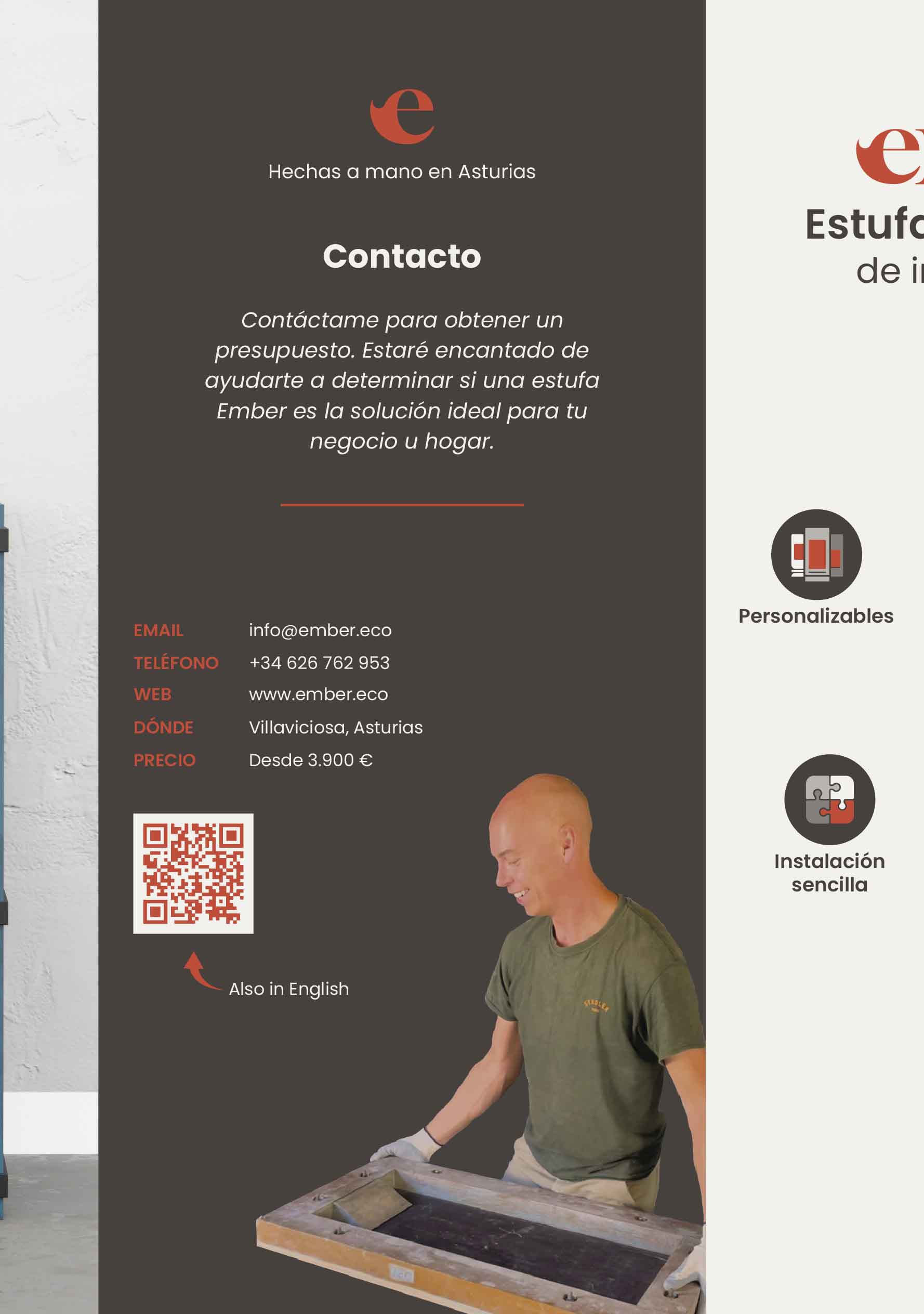

We highlighted key decision-making factors such as weight, dimensions, heat per firewood load, and ideal surface area, along with a larger product image for better detail appreciation. This information was placed on a crucial page—the first visible upon opening, on the right. A compelling phrase emphasizes the stoves’ benefits, encouraging further reading. On the back, we included contact details, highlighting two key points: access to information in English, given the high demand from expatriates, and an image of the artisan in his workspace to reinforce trust and authenticity.

