Nowzen
Brand Design
Brand Strategist & Designer

Nowzen is a brand that merges Asian spirituality with mindful living, offering cooking classes focused on healthy vegan and vegetarian recipes. Rooted in the philosophy of living in the present, it promotes simplicity, balance, and a deep connection with food. Through its minimalist approach, Nowzen encourages a return to organic, locally sourced ingredients, helping individuals cultivate a more conscious and sustainable lifestyle. In addition to cooking courses, the brand provides locally made vegan products, reinforcing its mission of nourishing both body and mind through intentional, holistic choices. Check out the full Brand Guidelines here →
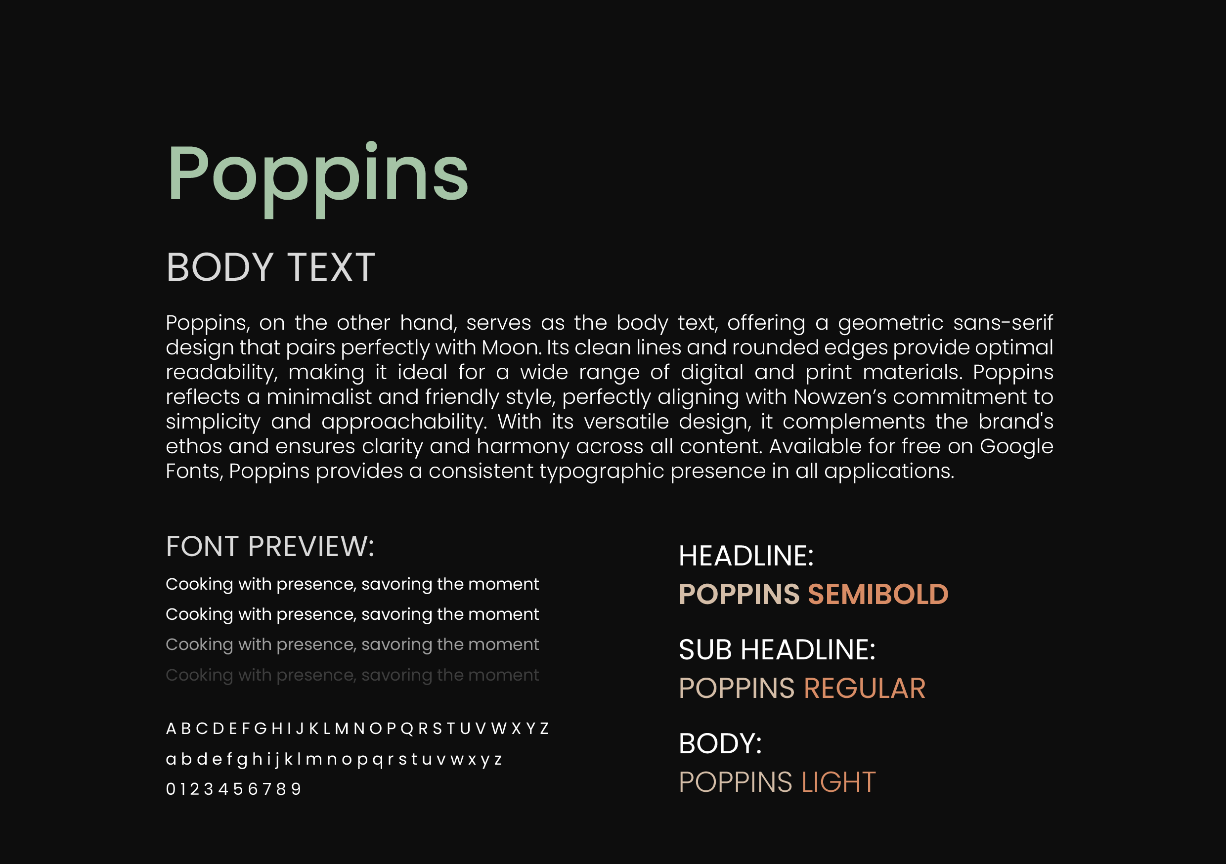
Nowzen merges the concepts of “now” and “zen,” emphasizing presence, balance, and simplicity in a fast-paced world. Its logo reflects this philosophy, with a modified “n” forming arches that symbolize harmony and minimalism. By stripping away the unnecessary, Nowzen encourages mindful cooking, organic local food, and a sustainable, intentional lifestyle.
Clear space ensures that the logo remains legible and distinct by preventing type, imagery, or other graphic elements from interfering with it. No graphic elements should encroach on the area around the logo. Additionally, this space allows for flexibility in future collaborations with other brands, ensuring that the integrity and visibility of the logo are maintained even when partnering with others.


Brand colors – Nowzen’s primary color palette embodies simplicity, harmony, and a deep connection to nature. Charcoal represents grounding and stability, providing a strong, timeless foundation. Coconut symbolizes purity and clarity, reinforcing minimalism and mindfulness. Matcha brings freshness and vitality, reflecting the brand’s focus on plant-based nourishment. Stone adds a natural, balanced touch, evoking serenity and the organic textures of the earth. Together, these colors create a refined, calming aesthetic that aligns with Nowzen’s philosophy of mindful cooking and intentional living.

Secondary colors – Nowzen’s secondary colors add warmth, depth, and vibrancy to the brand’s visual identity. Almond Toasted brings a sense of comfort and natural warmth, reminiscent of wholesome, nourishing ingredients. Salted Blue Marine introduces a deep, grounding element, symbolizing tranquility and balance, much like the vastness of the ocean. Paprika Spice adds an energizing touch, reflecting the vibrancy and boldness of plant-based flavors. These accent colors complement the primary palette, creating a dynamic yet harmonious visual experience.


Colorimetry is essential in my projects, as it allows me to create visually harmonious compositions and effectively convey emotions. A well-executed use of color not only enhances aesthetics but also strengthens brand identity and visual storytelling.
By applying colorimetry principles in graphic design and video editing, I adjust exposure, contrast, color balance, and saturation to achieve visual consistency that enhances the message and the viewer’s experience.


