Vitalery
App Design UX/UI
Lead UX
In a world where maintaining a healthy lifestyle is a priority, finding nutritious bakery options with fast and reliable delivery remains a challenge. Vitalery app is designed to meet that need, offering premium, healthy bakery products tailored to each customer’s preferences and delivered in the shortest possible time.
Understanding the user
I conducted interviews and created empathy maps to understand users’ needs. A key group identified was health-conscious working adults who enjoy sweets but worry about their impact. Research confirmed the growing preference for organic, balanced, and healthy bakery products, while also highlighting the challenge of preserving them for more than a few days, complicating spontaneous ordering. Access to the interview document →
User personas & User journey map

Martha ‘s goal: Find a healthier way than traditional bakeries to satisfy her cravings and sweet tooth when she is at home.
Carlos’ goal: Find an online gluten-free bread for your gluten intolerant partner.
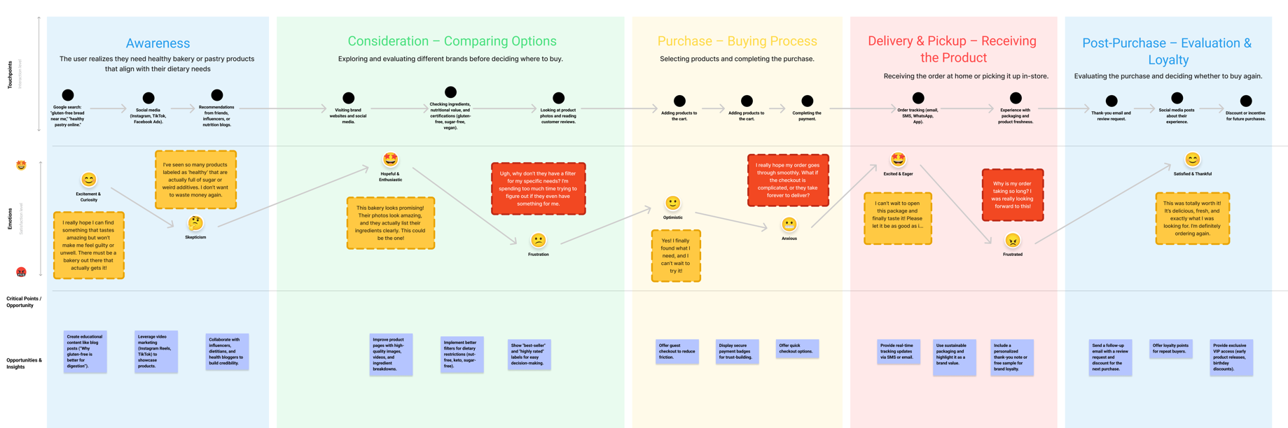
User research pain points
1. Limited availability
Few healthy bakeries offer online ordering, even in major cities.
2. Delivery delays
Same-day delivery options are rarely available, requiring advance orders.
3. Perishability
Customers struggle with short shelf life, making it difficult to plan without wasting or over-consuming.
Target audience

▫️ Health-conscious & selective
Individuals committed to a healthy lifestyle, seeking balanced bakery options tailored to their dietary needs.

▫️ Busy urban professionals
Working adults in metropolitan areas who need quick and efficient solutions without compromising quality or nutrition.
▫️ Dietary-specific consumers
Users with dietary restrictions (such as gluten-free, vegan, or fitness-focused) who require clear and safe options.

▫️ Experience-driven & tech-savvy
People who value the convenience of an intuitive and personalized shopping experience through a mobile app.
Problem statements
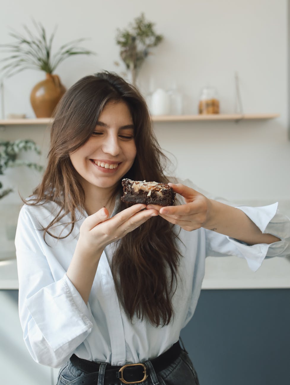
Martha, a businesswoman in her 40s living in a metropolitan area, seeks a healthy way to satisfy her sweet cravings during times of stress while maintaining her commitment to a fit and healthy lifestyle.
If Martha can use a bakery app to order healthy sweets and cakes during moments of anxiety, she will feel better about her choices while also reducing her stress levels.
Carlos, a devoted husband in his 30s and a long-term employee in a supportive workplace, wants to enjoy bakery products with his wife, who is gluten intolerant. He’s looking for a way to share their love for treats without compromising her health or spending excessive time searching for safe, gluten-free options.
If Carlos can use a bakery app that specializes in gluten-free products, he’ll be able to enjoy meaningful moments with his wife while ensuring her dietary needs are met with ease and reliability.
We recognize the urgent need to develop a Healthy Bakery App tailored to specific diets. The majority of our competitors rely on web apps, leaving a clear opportunity in the mobile space. With the rapid expansion of the health-conscious market, it has become essential for us to provide a mobile-first solution that not only meets the growing demand but also elevates the customer experience. By addressing this need, we can secure a stronger position in a fast-evolving market that lacks quality mobile offerings.
Usability study
Study details
Research questions
- How effectively can users find products tailored to their dietary needs?
- Do users experience a seamless process when completing their desired orders?
- What insights can we gather from the users’ steps when ordering a bakery item?
Participants
10 Participants aged 20-40 in metropolitan areas, with specific dietary needs or a strong commitment to a healthy lifestyle.
Methodology
Duration: 10 minutes
Location: Madrid
Format: Unmodetate usability study
Tasks: Users were prompted to explore a low-fidelity prototype

Usability study
Findings
1. Sparse content appearance:
Due to limited spacing, the app gave an impression of being overly minimalistic and lacking sufficient content, which affected user engagement.
2. Difficulty in differentiating dietary categories
Users found it challenging to distinguish between vegan, gluten-free, and fit products. The labeling and categorization lacked clarity, resulting in confusion during product selection.
3. Need for clear visual indicators
Users suggested adding distinct icons, colors, or filters to quickly identify products according to dietary preferences, improving the ease of navigation and selection.
Goal Statement
Our bakery app will enable users to filter and select products based on specific dietary needs, catering to health-conscious individuals or those with special diet requirements. By offering a precise and user-friendly experience, we ensure that users can effortlessly find and purchase items that align with their dietary preferences. We will measure the app’s effectiveness by analyzing the user journey across the various diet categories to assess ease of navigation and purchase success.

Starting the design
Wireframes & low fidelity prototype

To ensure a clear and accessible shopping experience, we have decided to filter products into three main categories: gluten-free, vegan, and fit. The key differentiator of our app compared to competitors is an intuitive labeling system that allows users to quickly identify which products meet their needs. To achieve this, we have assigned three distinct colors: green for vegan products, yellow for gluten-free, and red, our primary brand color, for fit products. This visual system simplifies selection and helps consumers make informed decisions quickly and efficiently.
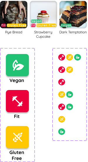


Accessibility is a fundamental aspect of our app, ensuring that all users, regardless of their abilities, can navigate and interact with it easily. When selecting colors for product categorization, we prioritized clarity, contrast, and inclusivity. The chosen colors offer high visibility and clear differentiation. This color-coding system enhances usability, allowing users to quickly identify products that suit their dietary needs while maintaining a visually appealing and accessible interface.
The design has been developed using a mobile-first approach, prioritizing a compact screen size as the baseline. This ensures seamless adaptability across various devices, preventing layout shifts or usability issues. By optimizing for smaller screens first, we guarantee a responsive and accessible user experience on all display sizes.


Logo & typography
Refining the design
The color palette reflects vitality and the energetic spirit of wellness. White keeps the app clean and uncluttered; magenta adds liveliness, contrasting with traditional bakery hues to convey the dynamic enjoyment of a fit lifestyle. Green highlights eco-friendly, vegan options, while yellow emphasizes gluten-free products—all fostering a fresh, health-conscious experience.

Working with modular components facilitates code reuse, reducing development time and improving maintainability. Additionally, components promote a clear and organized structure, allowing the team to add new features or make adjustments without affecting existing functionality, which is key to efficient and orderly project growth.

